


About this image
Climate Summit Executive Dashboard
AI model
 gemini-3.1-flash-image
- Dimension
- 16:9 (1376 × 768)
- Resolution
- 1K
Prompt
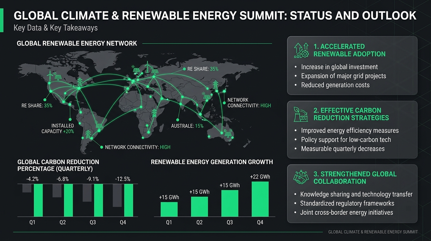
Executive presentation slide layout for a Global Climate & Renewable Energy Summit. Clean structured grid layout featuring a world map with green energy distribution nodes, quarterly carbon reduction percentage bar charts, and key takeaway summary cards. Dark charcoal matte background with crisp white typography and vivid emerald green data highlights.
Creative summary
The image is a professionally designed digital presentation slide titled at the top in large white sans-serif text. The background is a deep, dark charcoal color with a subtle, geometric dark grey grid pattern visible in the margins, giving the overall design a corporate, tech-forward aesthetic. The layout is structured in a clear, multi-column grid. Dominating the left and center is a stylized, grey-toned world map. Overlaid on this map is a vibrant, neon-green node-and-line network, connecting various geographic points with bright dots, straight lines, and icons representing energy infrastructure like wind turbines and solar panels. Text annotations in small white and green fonts are scattered around the map. Below the map, on the left, are two bar charts. The first, on the far left, shows a series of downward-facing columns alternating between dark grey and bright neon green, with percentages displayed above. The second chart shows ascending columns representing growth, increasing in height from Q1 to Q4, also rendered in neon green against the dark background. The right side of the slide features three rectangular, soft-cornered information cards in a slightly lighter charcoal grey than the background. Each card contains a bold, neon-green header, a small icon to the left of the header, and three bullet points in white text detailing key summit takeaways. The color palette is strictly limited to dark charcoal greys, pure white for main text, and a vivid, electric neon green used for accents, charts, and data visualization. The rendering is clean, flat, and vector-based, typical of high-end infographics or business software user interfaces, maintaining high readability and a balanced visual hierarchy. No lighting effects or shadows are present, as the image relies on high-contrast, flat design principles to convey information clearly.
Made with JammyJar
Create your own with JammyJar