


この画像について
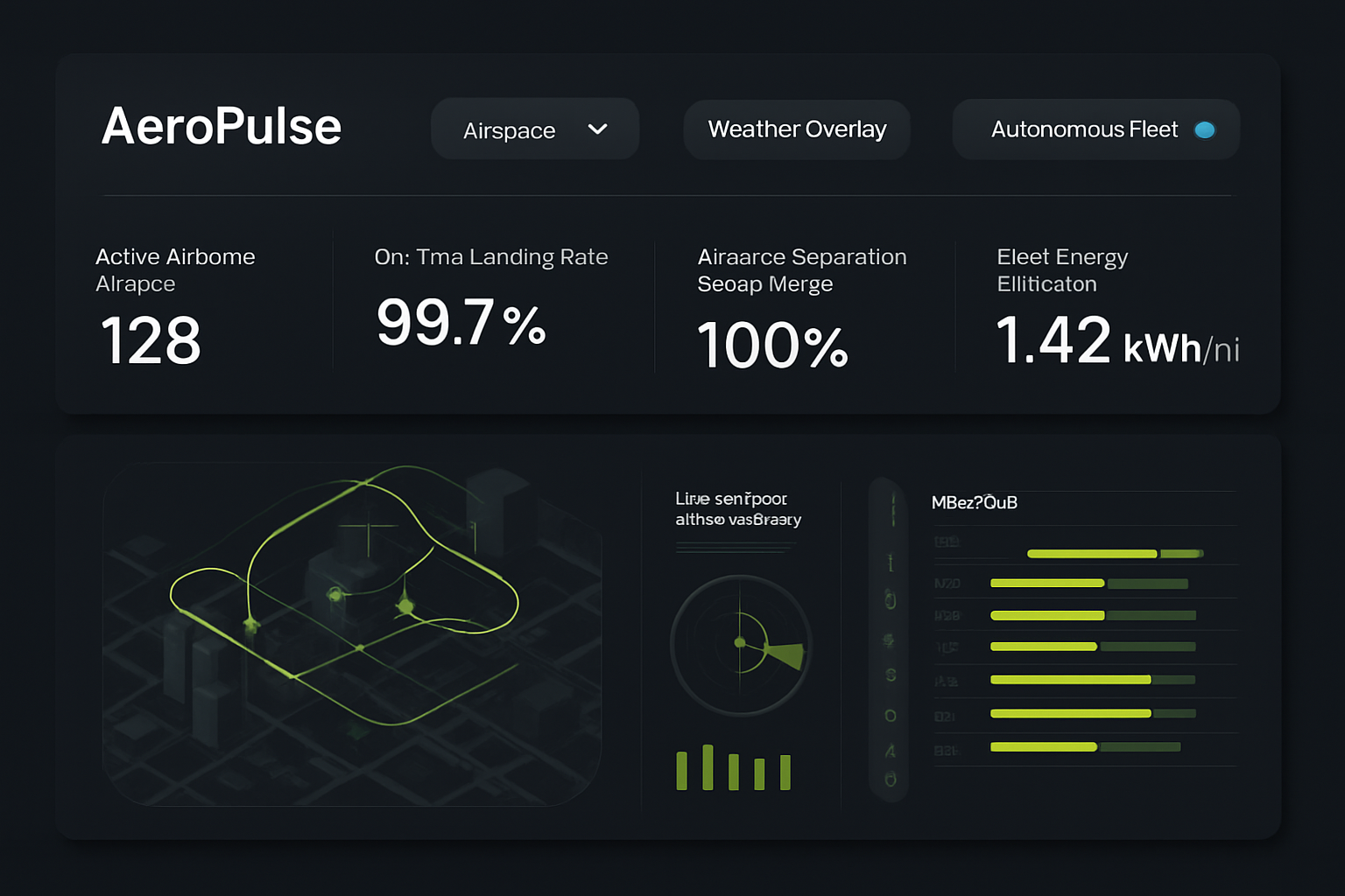
AeroPulse Urban Airspace Dashboard
AIモデル
 gpt-image-1-mini
- サイズ
- 16:9(1536 × 1024)
- 解像度
- 1K
プロンプト
High-fidelity desktop SaaS marketing website hero interface for 'AeroPulse' (/fleet/telemetry-live), an eVTOL urban air mobility flight orchestration and airspace traffic control suite. Deep midnight navy background (#0B0F19) with fluorescent electric cyan #00E5FF and bright warning coral accents. Top bar features airspace sector selector, weather overlay switch, and autonomous fleet status toggle. Top row displays 4 metrics: 'Active Airborne Aircraft' (128), 'On-Time Landing Rate' (99.7%), 'Airspace Separation Safety Margin' (100%), and 'Fleet Energy Efficiency' (1.42 kWh/mi). The center display features a layered 3D holographic urban airspace corridor map showing dynamic flight paths above a stylized city grid, alongside a live vertiport slot occupancy schedule and micro-weather radar feed. Precision aerospace SaaS interface, high contrast, clean vector data visualization.
クリエイティブサマリー
The image is a high-fidelity, dark-mode software dashboard interface featuring a clean, modern SaaS design. The background is a very deep, matte charcoal or midnight navy, creating a stark contrast for the data visualizations. The layout is divided into two primary rectangular panels, both with rounded corners. The top panel functions as a header with navigation and metrics. On the left is a title text, followed by three pill-shaped buttons with rounded edges; the first is a dropdown, the second is a standard action button, and the third is a toggle button with a small cyan circular indicator. Below these buttons, four data cards are arranged horizontally. Each card contains a label and a large numerical value, styled in a clean, sans-serif white font. The bottom, larger panel displays two main visual components on a dark background. On the left is an isometric, stylized 3D city map with simplified grey building blocks. Overlaid on this map are glowing, vibrant lime-green flight paths or traffic vectors, depicted as continuous lines and geometric shapes, with small arrows indicating directionality. To the right of the map, there is a secondary information cluster consisting of a circular radar or sonar-like scope with glowing green radial lines and a scanning wedge. Below this is a bar chart with short, vertical lime-green bars. Adjacent to the radar is a vertical list of icons, each followed by a horizontal bar chart where the filled portion is lime-green and the empty portion is a muted, dark olive. The overall aesthetic is professional, technical, and analytical, using a color palette restricted to deep charcoal, white, and varying intensities of electric and lime green to signify active data streams and monitoring systems.
JammyJarで作成
JammyJarで自分の作品を作る