


Synthetix Bio Protein Engineering
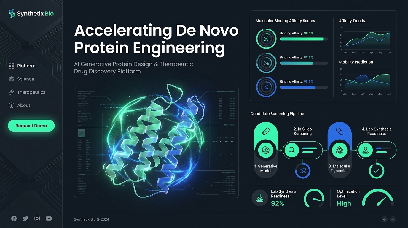
This digital dashboard interface showcases a high-fidelity design for a biotechnology platform. The overall layout is dark-themed, using a deep slate grey background. On the left, a sidebar contains navigation links and a prominent glowing mint-green pill-shaped button. The main section features a large, central, three-dimensional visualization of a complex protein structure. The protein itself is rendered in a gradient of mint green and royal blue, surrounded by a faint, glowing, particle-like energy sphere. This central graphic is flanked by data panels and user interface elements typical of specialized scientific software. On the right side, several dashboard modules are present: a section titled 'Molecular Binding Affinity Scores' shows circular radial gauges with specific data points, adjacent to line charts titled 'Affinity Trends' and 'Stability Prediction,' both displaying fluctuating data curves on a grid. Below this, a 'Candidate Screening Pipeline' graphic illustrates a four-step process connected by arrows, incorporating icons such as a pill, magnifying glass, atom, and flask. These UI elements use a distinct color palette of royal blue and vibrant mint green against the dark grey backdrop, with crisp white sans-serif typography for all labels and data figures. The interface includes subtle, technical-looking grid overlays, faint coordinate markers, and small scientific iconography throughout. The overall mood is futuristic, clean, and highly technical. The rendering is sharp and polished, resembling a high-end web application interface, with consistent light-emitting effects on the functional elements, suggesting a glowing, bioluminescent aesthetic against the otherwise matte dark background.
- Model
- gemini-3-pro-image
- Dimension
- 16:9
- Resolution
- 1K
Made with JammyJar
Create your own with JammyJar