
AuraCommerce Luxury Personalization Dashboard
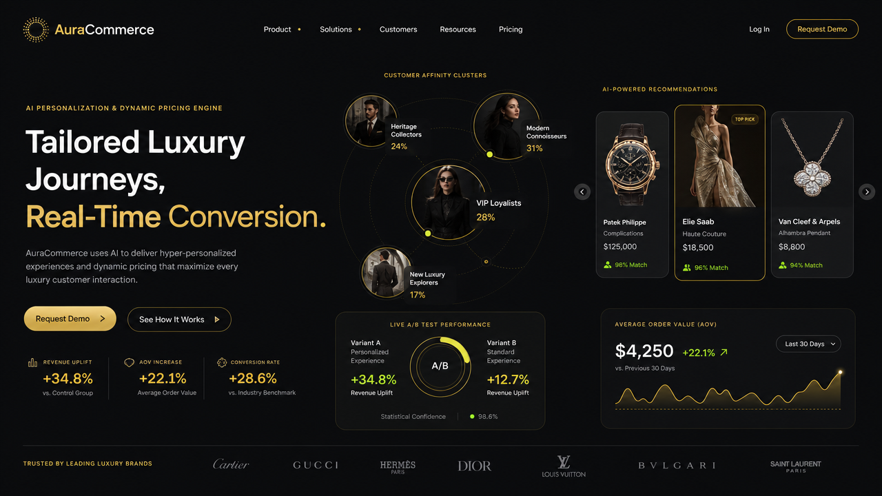
This is a sleek, dark-themed hero section for a luxury commerce technology website. The background is a deep charcoal-black, creating a high-contrast canvas for UI elements presented in a palette of warm champagne gold, crisp white, and muted grey. The layout is organized into distinct content blocks. On the left, large sans-serif typography dominates, with text blocks discussing AI personalization. Below this are two interactive-style buttons in gold and outlined black. At the bottom left, a row of three key performance metrics appears, each marked by a small linear icon. Central to the composition is an orbital diagram showing four circular portraits of luxury-dressed individuals, connected by thin gold lines in a cluster arrangement. To the right, a carousel display presents product cards featuring a watch, a gown, and a piece of jewelry, each with associated metrics and match percentages. Below these are two dark, rounded-corner cards: one displaying A/B test performance as a circular progress graph, and the other a line graph charting average order value over time, plotted in gold against a black grid. The very bottom of the screen features a horizontal footer-style band listing several luxury brand names in white serif and sans-serif fonts. Throughout the entire interface, the lighting is artificial and polished, with a focus on gold accents that glow softly against the matte black background. The overall aesthetic is professional, modern, and high-end, utilizing clean lines, balanced negative space, and a hierarchical structure that guides the eye from the left-hand messaging towards the central data visualization and the right-hand product recommendations. Text is present in every section: headlines, sub-headers, labels, numerical data, and logos in the footer. The rendering is a sharp, high-fidelity 2D digital graphic design.
- Model
- gpt-image-2
- Dimension
- 16:9
- Resolution
- 1K
Made with JammyJar
Create your own with JammyJar