


À propos de cette image
Quantum Logistics Control Dashboard
Modèle d'IA
 gpt-image-1-mini
- Dimension
- 16:9 (1536 × 1024)
- Résolution
- 1K
Prompt
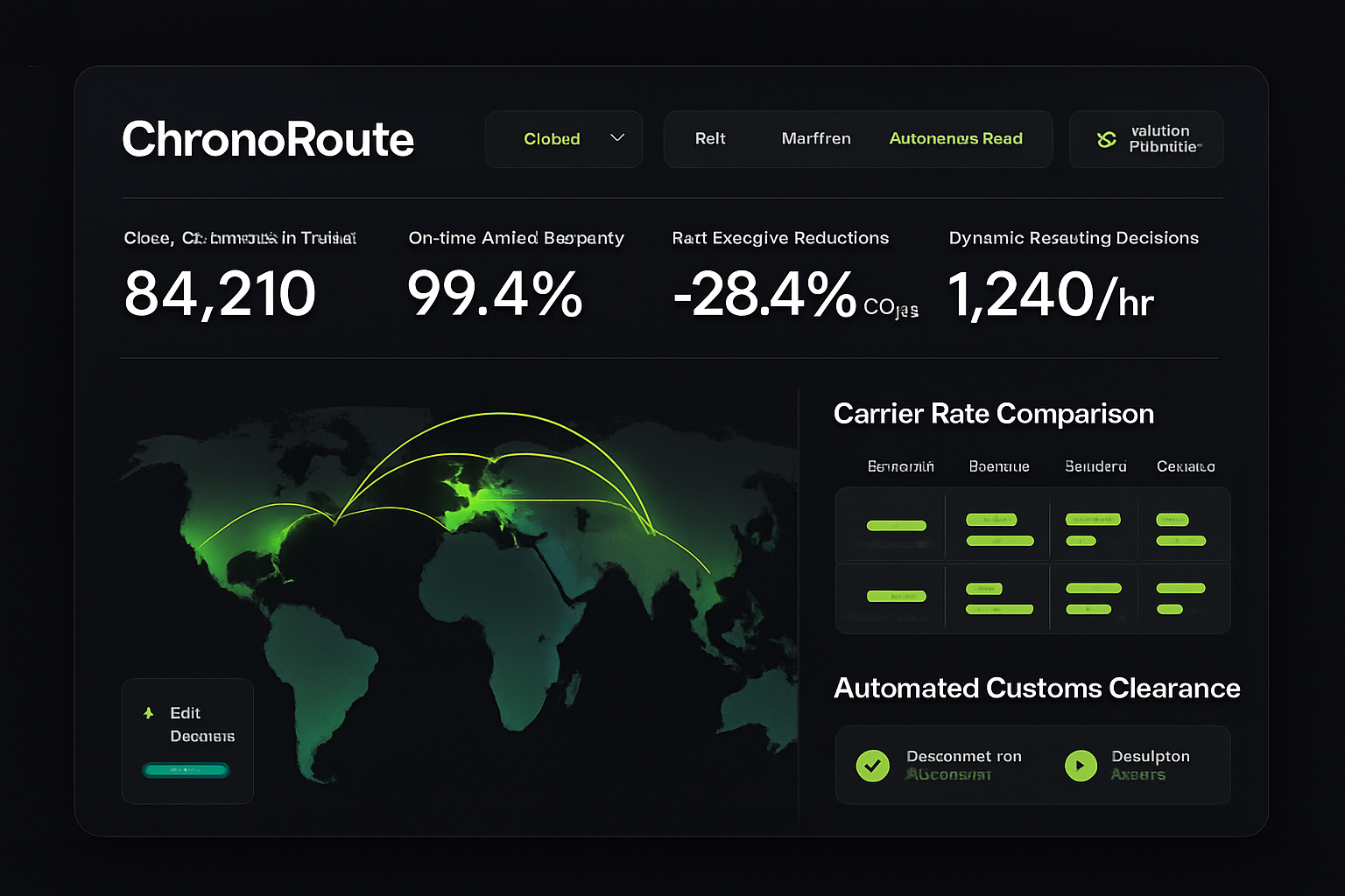
High-fidelity desktop SaaS marketing hero interface for 'ChronoRoute' (/logistics/autonomous-network), a quantum-inspired supply chain routing and multimodal fleet dispatch dashboard. Deep obsidian background (#101216) with radiant amber gold #FFB300 and electric blue accents. Header features global freight lane selector, transport mode toggles (Rail, Maritime, Autonomous Trucking, Air Cargo), and weather disruption predictive filter. Top metrics bar highlights: 'Global Shipments in Transit' (84,210), 'On-Time Arrival Accuracy' (99.4%), 'Fuel Emission Reductions' (-28.4% CO2e), and 'Dynamic Rerouting Decisions' (1,240/hr). Central view shows a 3D isometric global routing arc map across continents with real-time port bottleneck heatmaps, paired with a dynamic carrier rate comparison matrix and automated customs clearance checklist on the right. High informational density, clean enterprise UI, precise vector charts.
Résumé créatif
This is a high-fidelity software dashboard interface, presented as a digital UI rendering. The aesthetic is modern, sleek, and data-dense, characterized by a dark theme featuring a deep charcoal and obsidian background. The layout is organized into distinct functional areas within a card-like container with rounded corners. The top header displays navigation menus with various dropdowns and buttons, utilizing a clean, sans-serif white typography, with specific active states highlighted in a vibrant, lime-green neon hue. Below the header, a primary row presents four key performance indicator metrics, each featuring a large bold number and a smaller descriptive label beneath it. The central portion of the interface is dominated by an interactive map visualization showing a global map in shades of dark forest green, overlaid with thin, luminous lime-green arc lines depicting routes between continents. To the right, a vertical section titled 'Carrier Rate Comparison' presents a grid of data rows with lime-green rectangular indicators representing bar charts or progress levels. Beneath this, another section titled 'Automated Customs Clearance' contains two actionable button elements, each featuring a lime-green circular icon—one a checkmark, the other a play symbol. A smaller secondary card sits in the lower-left corner, featuring a 'Edit' icon and a small status indicator bar, also in lime green. The color palette is strictly limited to the dark obsidian background, off-white text, and an electric, vibrant lime-green for all data visualizations, active status indicators, and UI accents. The rendering is clean, sharp, and flat, suggesting a professional-grade web application interface designed for high-frequency data monitoring and logistics management, with a high-contrast and minimalist aesthetic.
Créée avec JammyJar
Créez la vôtre avec JammyJar