


À propos de cette image
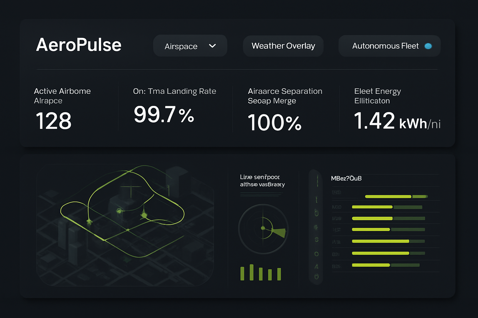
AeroPulse Urban Airspace Dashboard
Modèle d'IA
 gpt-image-1-mini
- Dimension
- 16:9 (1536 × 1024)
- Résolution
- 1K
Prompt
High-fidelity desktop SaaS marketing website hero interface for 'AeroPulse' (/fleet/telemetry-live), an eVTOL urban air mobility flight orchestration and airspace traffic control suite. Deep midnight navy background (#0B0F19) with fluorescent electric cyan #00E5FF and bright warning coral accents. Top bar features airspace sector selector, weather overlay switch, and autonomous fleet status toggle. Top row displays 4 metrics: 'Active Airborne Aircraft' (128), 'On-Time Landing Rate' (99.7%), 'Airspace Separation Safety Margin' (100%), and 'Fleet Energy Efficiency' (1.42 kWh/mi). The center display features a layered 3D holographic urban airspace corridor map showing dynamic flight paths above a stylized city grid, alongside a live vertiport slot occupancy schedule and micro-weather radar feed. Precision aerospace SaaS interface, high contrast, clean vector data visualization.
Résumé créatif
The image is a high-fidelity, dark-mode software dashboard interface featuring a clean, modern SaaS design. The background is a very deep, matte charcoal or midnight navy, creating a stark contrast for the data visualizations. The layout is divided into two primary rectangular panels, both with rounded corners. The top panel functions as a header with navigation and metrics. On the left is a title text, followed by three pill-shaped buttons with rounded edges; the first is a dropdown, the second is a standard action button, and the third is a toggle button with a small cyan circular indicator. Below these buttons, four data cards are arranged horizontally. Each card contains a label and a large numerical value, styled in a clean, sans-serif white font. The bottom, larger panel displays two main visual components on a dark background. On the left is an isometric, stylized 3D city map with simplified grey building blocks. Overlaid on this map are glowing, vibrant lime-green flight paths or traffic vectors, depicted as continuous lines and geometric shapes, with small arrows indicating directionality. To the right of the map, there is a secondary information cluster consisting of a circular radar or sonar-like scope with glowing green radial lines and a scanning wedge. Below this is a bar chart with short, vertical lime-green bars. Adjacent to the radar is a vertical list of icons, each followed by a horizontal bar chart where the filled portion is lime-green and the empty portion is a muted, dark olive. The overall aesthetic is professional, technical, and analytical, using a color palette restricted to deep charcoal, white, and varying intensities of electric and lime green to signify active data streams and monitoring systems.
Créée avec JammyJar
Créez la vôtre avec JammyJar