


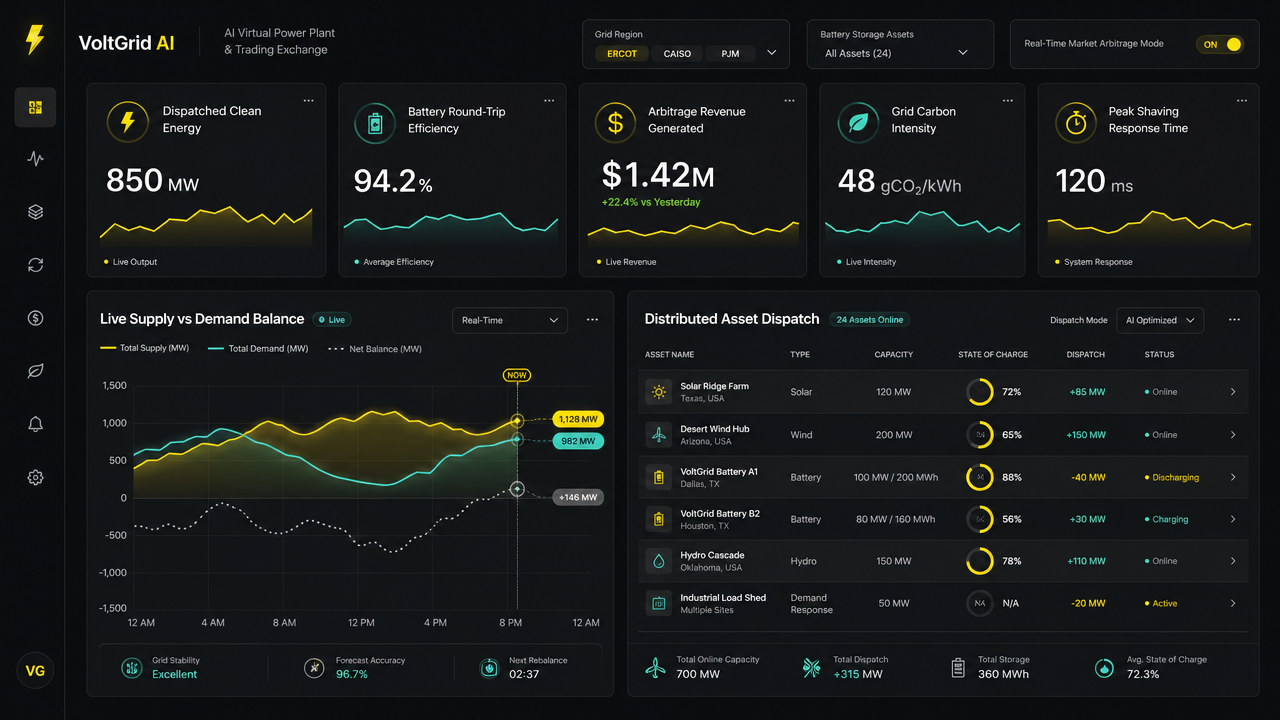
VoltGrid AI Energy Dashboard
The image displays a high-fidelity software dashboard interface for a power management platform, presented in a dark mode aesthetic. The background is a very dark, matte charcoal gray, providing a clean surface for the data visualization components. The layout is structured with a vertical navigation bar on the far left containing icon buttons. At the top left corner is a logo followed by descriptive text. Across the top, there are three filter dropdown menus. The main body consists of five primary data metric cards along the top row, each featuring a numeric value and a line graph in varying colors like vibrant electric yellow and aqua mint. Below these, the layout splits into two large sections: a large chart on the left tracking 'Live Supply vs Demand Balance' with three overlapping line graphs (two solid colored, one dotted white) plotted against a time axis, and a detailed list on the right titled 'Distributed Asset Dispatch' showing a table of energy assets, their capacity, state of charge represented by circular ring charts, and dispatch status indicators in green and yellow text. Each section is contained within soft-edged, slightly elevated card panels. The typography is a clean, sans-serif font, appearing white or light gray, with key data points highlighted in bright yellow or cyan. Text is present in various headers, labels, and status indicators throughout the interface. Small circular icons are dispersed, including lightning bolts, battery symbols, wind turbines, droplets, and gear icons. The overall mood is professional, technical, and data-centric, emphasizing real-time monitoring and control. The color palette relies heavily on the deep charcoal background contrasting against neon accents of electric yellow, bright aqua mint, and muted white, creating a sleek, futuristic high-tech appearance typical of modern SaaS platforms.
- Modell
- gpt-image-2
- Format
- 16:9
- Auflösung
- 1K
Erstellt mit JammyJar
Erstellen Sie Ihr eigenes mit JammyJar